Blog > BrandingYoung people

Calderdale SEND Youth Representatives logo

Posted by Jonny Holden | April 3, 2024

a hand drawn tree with icon leaves in different colours
The original idea from the young people

The starting point

The group of young people who represent the children and young people with SEND in Calderdale were orignally called the "SEND Reference Group". They decided to change the name, wanted an identity that went with that.

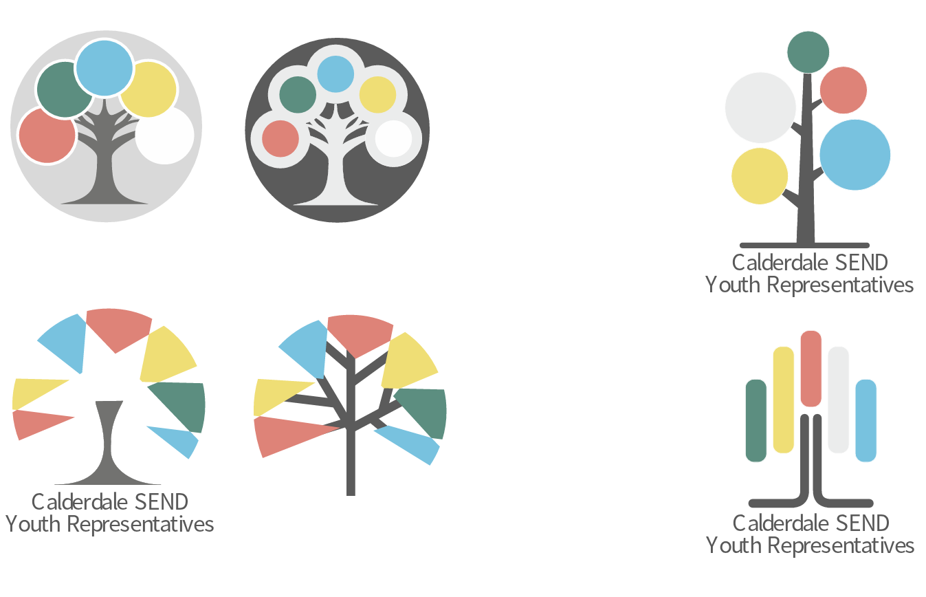
The idea of their sketch was that the words at the bottom represented the roots from which all the young people could grow. The leaves in different colours represented the variety of disabilities.

The development of the idea

There were many ideas explored in discussion with the young people

Various ideas for the logo

See the full development document

The final logo, 4 ways
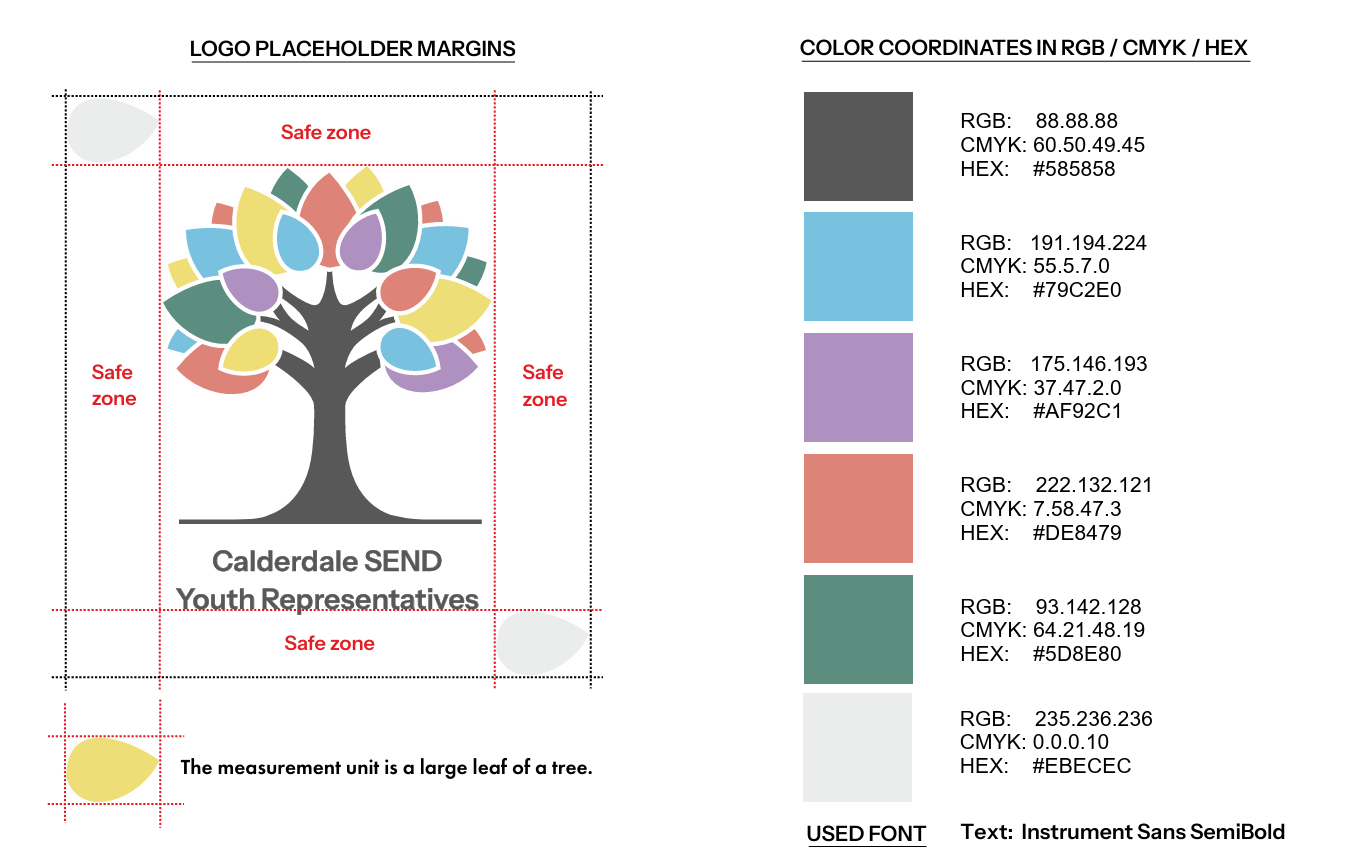
the light version of the logo with white trunk
the dark version of the logo with black trunk
For dark and light backgrounds, with the text
the light version of the logo with no text
the dark version of the logo with no text
For dark and light backgrounds, without the text

Brand guidelines

Take a look at the  brand guidelines pdf

Margins and colour scheme

The logo in action

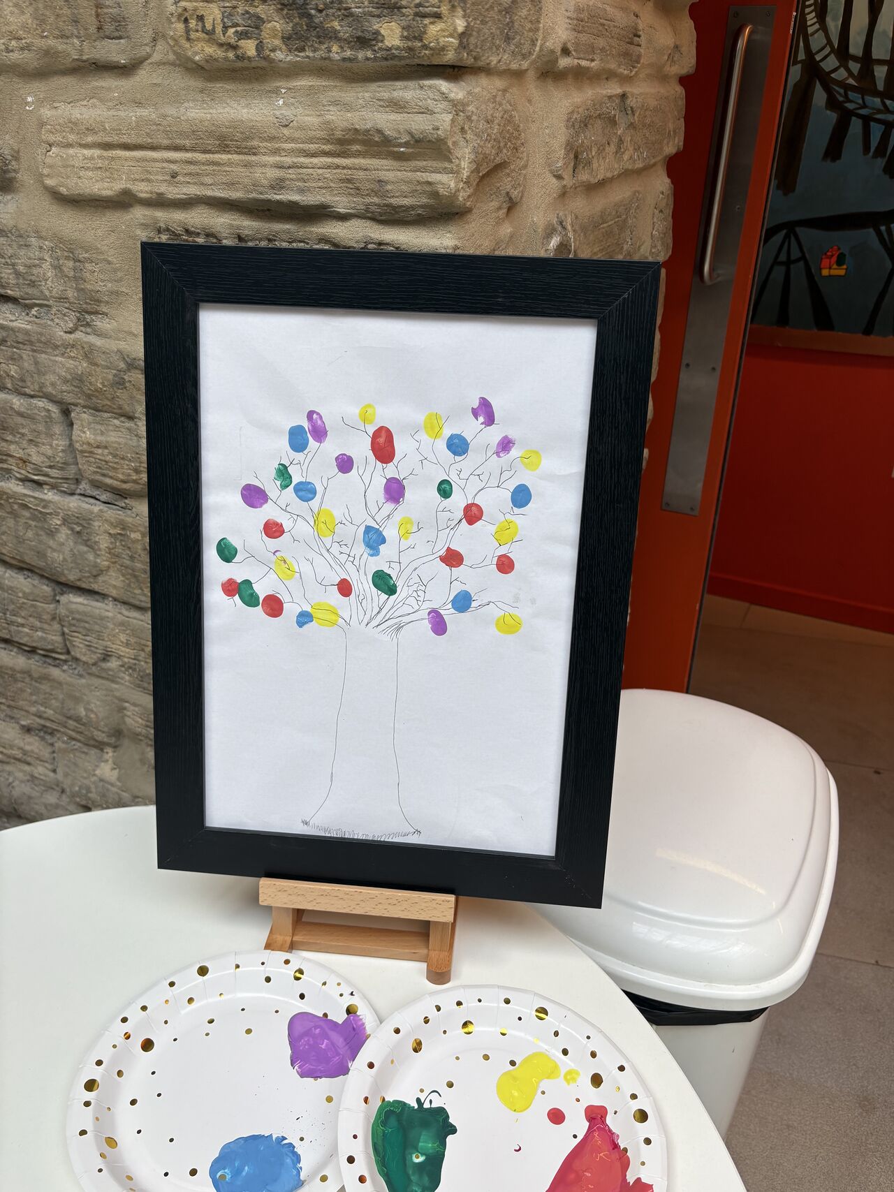
In July 2025, the SEND Youth Reps organised a Disabled Pride event, and one of the activities was to add your fingerprint to an image of a tree!

See the full story on LinkedIn

a drawing of a tree with lots of different coloured fingerprints on it
The logo, in fingerprints

You might also enjoy

A restart for RESTART

RESTART, part of the Brooke Taylor Educational Consultancy, asked us for a logo and re-brand as they drive towards a more professional image.

Posted by | September 19, 2019